

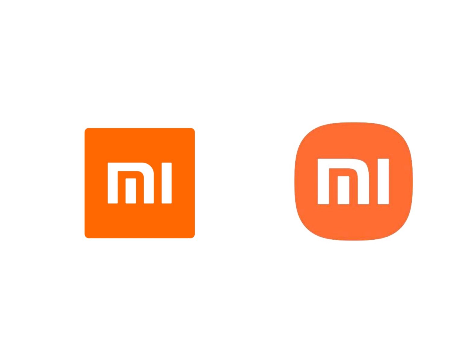
In 2021, Hara partnered with Xiaomi, designing a new logo for the company, which was unveiled on 31 March 2021. Hara and his company converted the previous square logo into a combination of a square and a circle. He earned $300,000 from the project.
Reconsidering my life choices right now…
For reference. 90% of logo changes seem to be the bullshit “inspiration”. From Xiaomi: “Kenya HARA used the “superellipse” mathematical formula when designing the logo of Xiaomi. While there are infinite options between a square and a perfect circle, the designer achieved a visually optimal dynamic balance by adjusting the variables in the formula. Using n=3 struck the perfect balance between a square and a circle, epitomizing the core aspect of “Alive”, resulting in the brand new Xiaomi logo we see now. Compared with a right-angled object, a circle is a shape that is more agile, which is the perfect representation of Xiaomi’s flexibility, relentlessness and its will to move forward.”
It’s shit lol.