
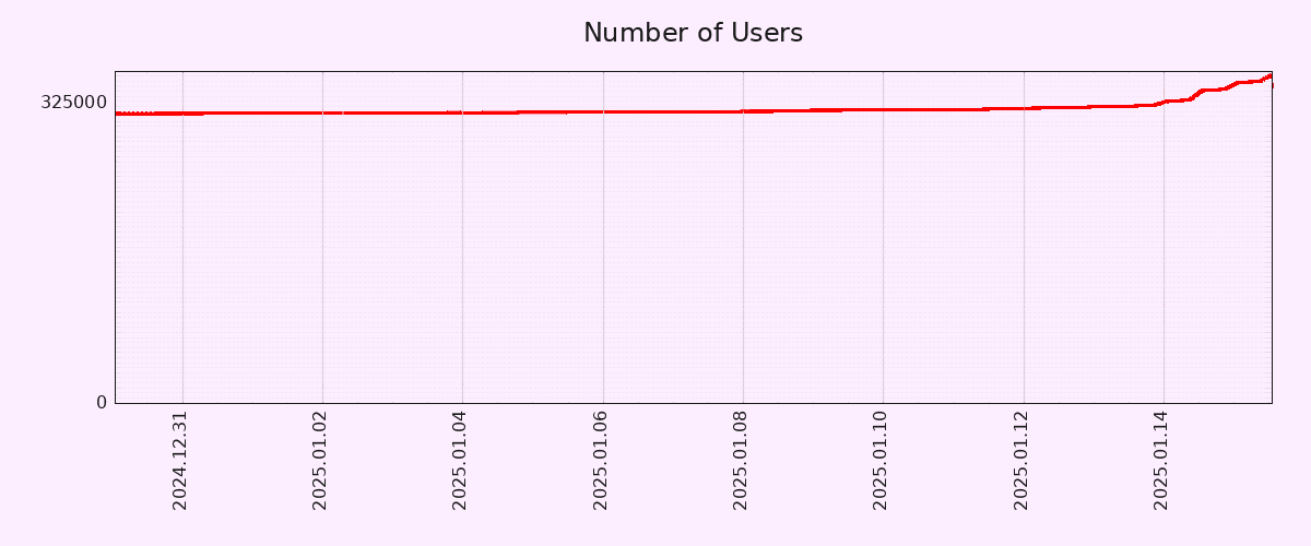
Editing to let people know that I will be blocking anyone who feels the need to tell me why this graph is inaccurate. I truly don’t care, but feel free to chime in with your useless take and land a spot on my block list! 🙂
You must log in or register to comment.
Lies, damn lies, and graphs that don’t have the Y-axis starting at 0.
10% growth in a day is nice, but far from a revolution. Let’s see this trend going for a month.
Wake me up in 2 months when 80% of new users churned.
I’ve never been on IG but I’m strongly considering a pFed account. Am I churn or am I miniscule net-new?
And yeah, it’s a hope that the rumoured meta toxicity is somehow magically not on pFed. I wanna see my nephew’s designs and art but not the influencerati junk I fear is on the captive platform.
Monthly active users increased by 43% between 13 and 14 January: https://pixelfed.fediverse.observer/dailystats
I don’t think anyone here is arguing that the entire world will be using pixelfed by the end of the year, and that its usage will expand to other galaxies by the end of the decade.
It’s a comment about the current growth curve, and it is both accurate and interesting.
Lemmy had the same jump in numbers during the Reddit Exodus. Mastodon had a huge boost when Elon bought Twitter.
Every spike has been a followed by a slide back to baseline in less than a couple of months. After you’ve seen it happen so many times, it is no longer interesting.
The fact that you believe these platforms were the same before and after these events makes it sound like you were not, in fact, there to see it happen. In my experience, it permanently changed both platforms, transforming them from weird niche sites to genuine alternatives.
That said, what you find interesting or not is not any of my business.
I am here since before the Reddit backout and I am on Mastodon since 2018. Lemmy was at 15k MAU, went up to over 125k and now is 1/3 of that. Mastodon had
1M575k something before Elon, hit up close to2M1.5M and now is sitting around 800k. (edit: I was looking at the overall charts and used wrong figures. Corrected now.)Sure, if your reference point is waaaay before the spikes then what we have now seem “a lot”. However, my point is that these spikes are far from being indicative of mass adoption.
Lemmy was at 15k MAU, went up to over 125k and now is 1/3 of that.
So it increased by 200%
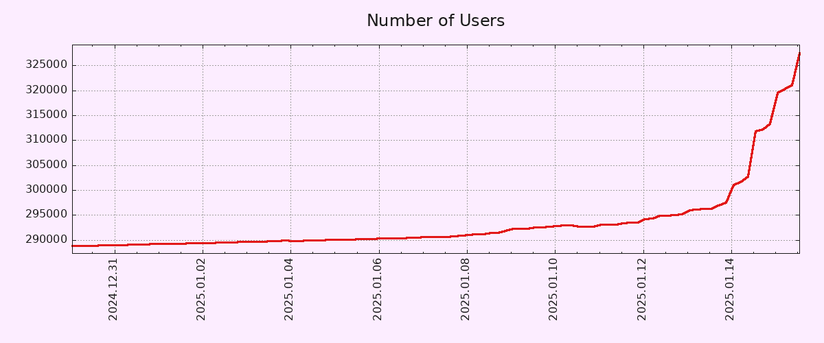
For other nerds that absolutely hate dishonest and biased graphs, I present the normalized data. Wow. What a vertical line. 🤦♀️
Just a FYI, Dan who made Pixelfed also does Loops and a few other Fedi projects in case people want more cool stuff to play with.
I signed up, though I generally don’t like following individuals and much prefer groups or communities like Lemmy. Gotta support independent social media.
To be fair, the Y-Axis doesn’t start from zero.
That being said, 10% account growth in 2 days is pretty solid. Let’s hope both account creation and engagement metrics (MAUs/DAUs) keep growing.
EDIT: Correct Axis type.


