

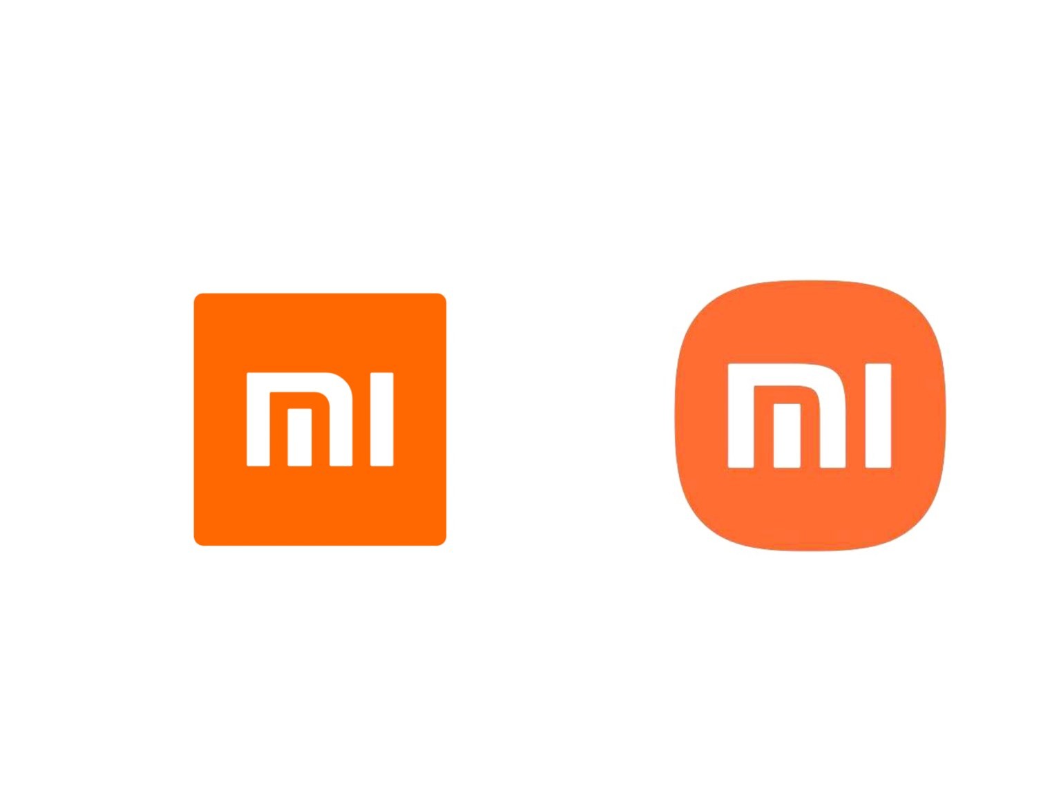
In 2021, Hara partnered with Xiaomi, designing a new logo for the company, which was unveiled on 31 March 2021. Hara and his company converted the previous square logo into a combination of a square and a circle. He earned $300,000 from the project.
Reconsidering my life choices right now…
Obviously they overpaid, but it was the company’s choice in a form of conspicuous consumption.
I feel conflicted because graphic design is a necessary job, but just from skimming over Kenya Hara’s history and work he strikes me as an avatar of all the most pretentious and pseudo-intelligent aspects of the modern culture of art that I hate.
The claim that it took him four years to design the logo is, on its face, garbage, but for people like him the process and the story of making the logo is how he created and maintains a veneer of being deep and working on a heightened creative and intellectual level. Had he taken the contract and returned in a week with the exact same logo and said “Yeah I messed around a little in photoshop and I think it looks pretty nice.” then it wouldn’t be worth $300,000. Everything in the world of these people needs an overdrawn explanation and story of creation and meaning and it makes me want to projectile vomit on or near them.
If you haven’t seen the Pepsi logo redesign doc from 2008 or 2009… well I hope you haven’t eaten anything recently.
It starts off doing some weird stuff with circles, the golden ratio, and old pepsi logos, slowly building to a frankly cultish crescendo of absurd marketing wankery.
“Absurd marketing wankery”
You saved the best for last. Well done.
Looks like he just saw an Android icon pack around the same time default icon style was shifting towards that same look. And just turned it in with a fancy story about how he “played with many shapes” (then show some quickly drawn or even some he did try) “before it just hit me” vibe. I wonder how many in-house employees might have come up with the same and just overlooked.
I have no doubt creating the design was much less intensive than his rambling story, but the company spent the money on him specifically and I’m sure they expected the rambling story.
That’s why I hate this part of art culture, the fakeness of it all. The obvious fakeness that people clap for because they think it makes them look more intelligent by nodding along.
deleted by creator